NET-A-PORTER | LOCALISATION
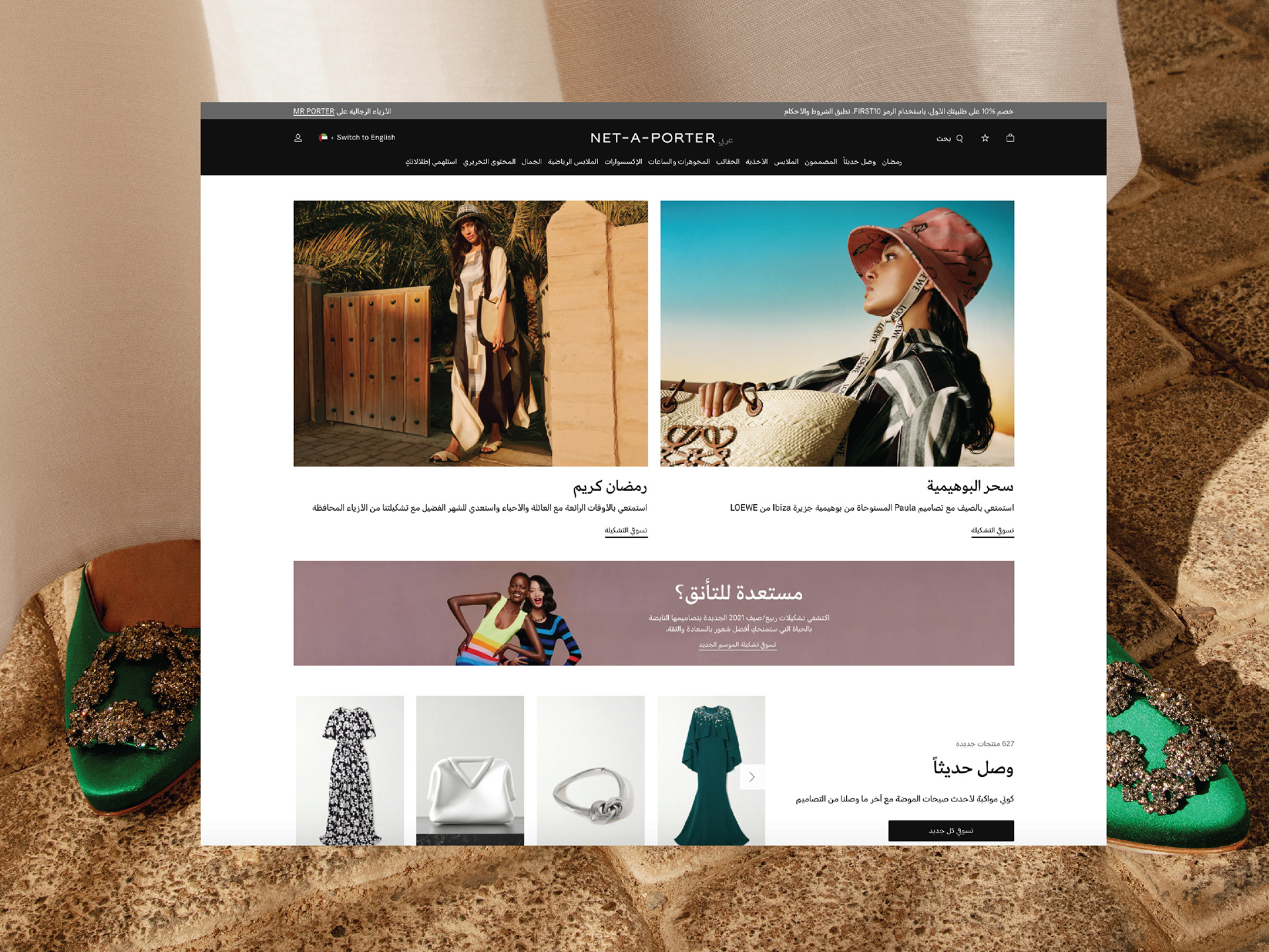
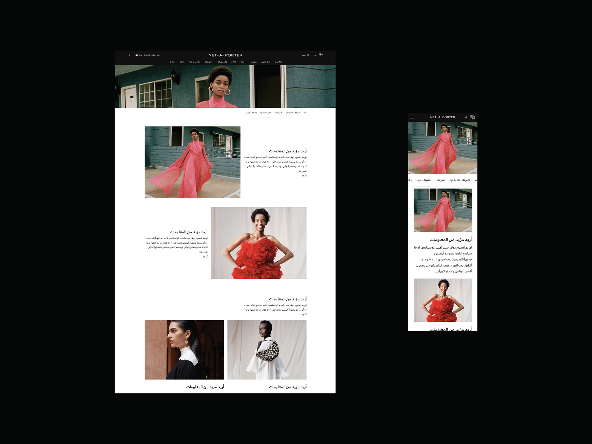
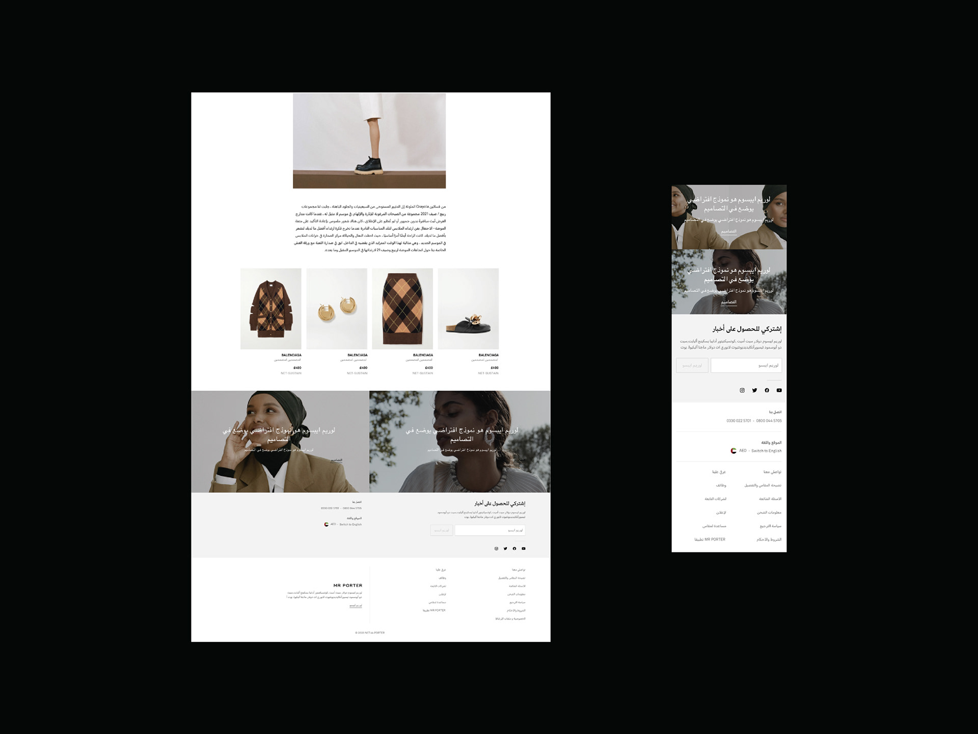
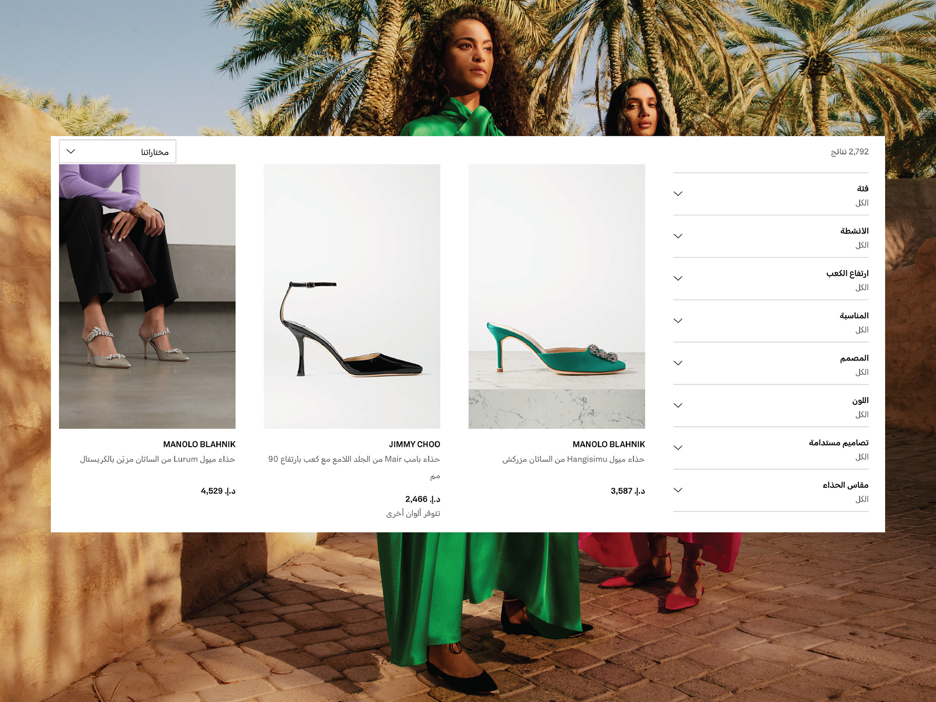
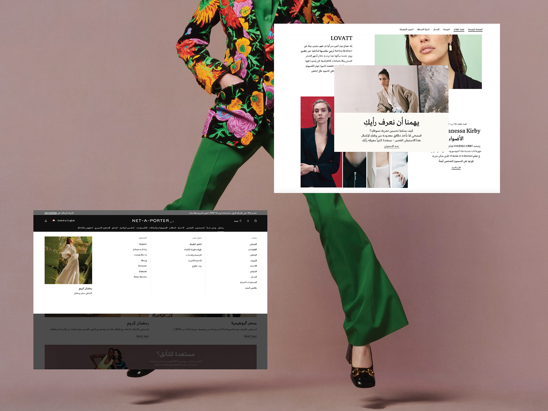
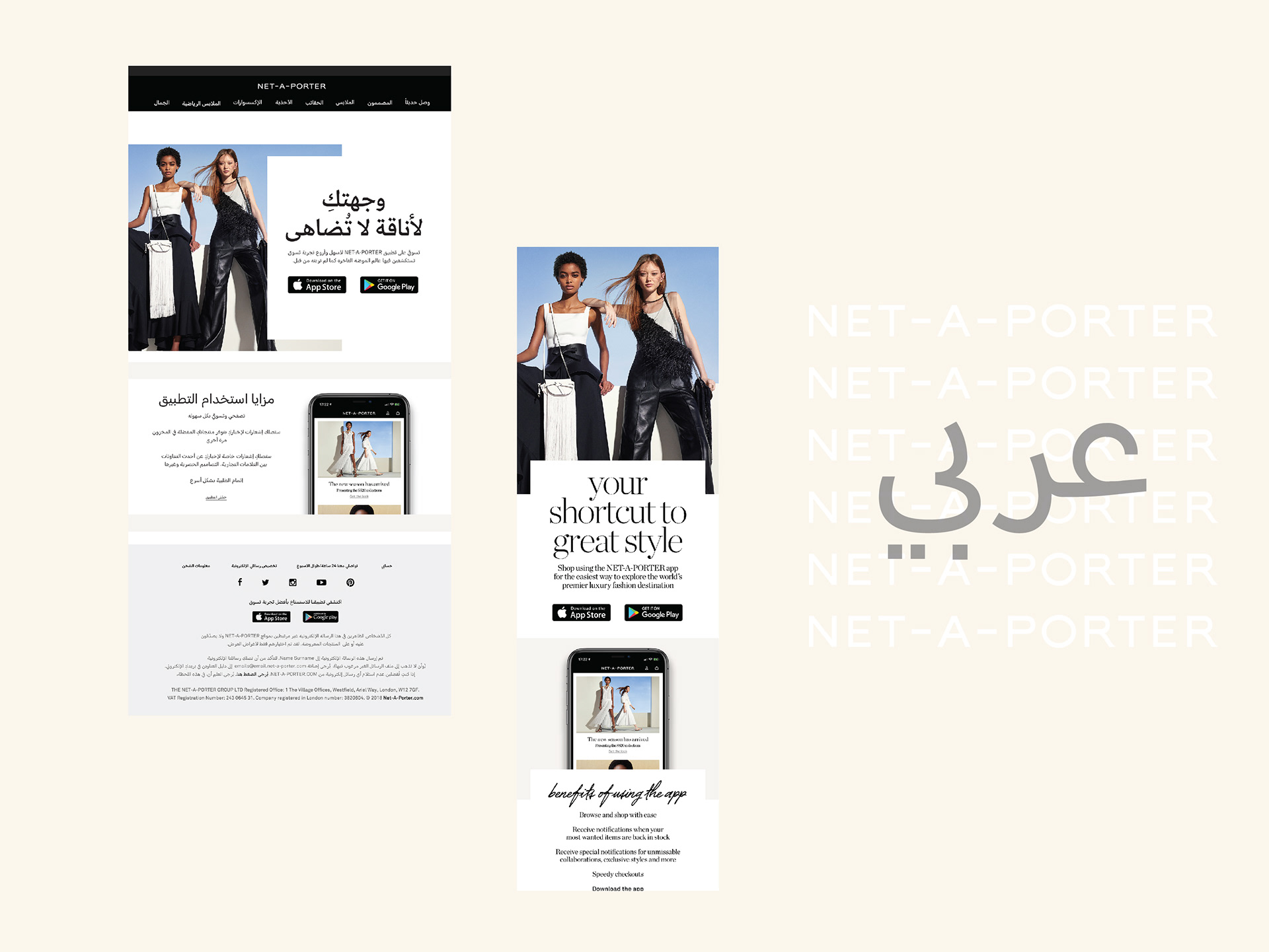
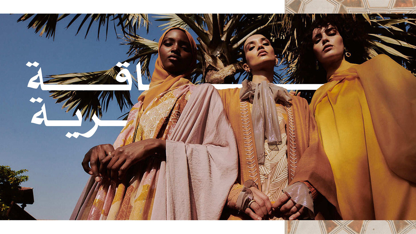
As part of the localization journey across the Middle East, the brand embraced the new target audience by creating dynamic Arabized design across several digital platforms as one of the leading multi-brand online retailers. The power of community and routing back to the region was the messaging behind the narrator's voice to reach the customers.
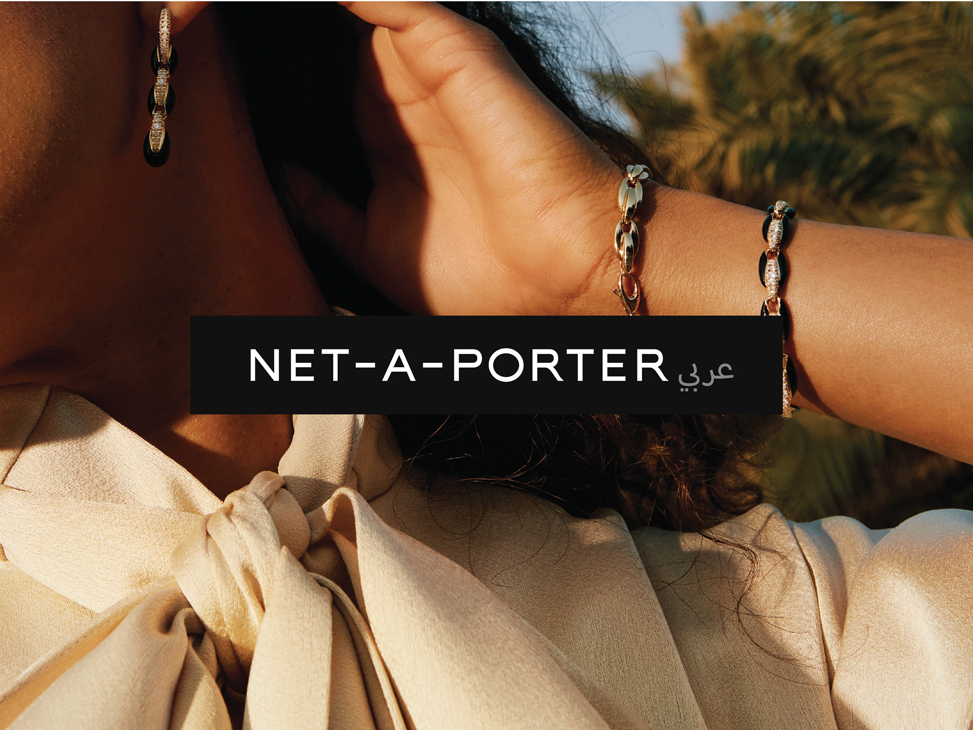
The navigation on the homepage was aimed at creating an enjoyable and smooth experience for a customer to reach their end journey. The Arabic logo created for Net-A-Porter relied on being visually balanced with the original English logo, the branding was to have its independent identity yet remains secondary. The typography was minimalistic, legible and clean. The branding takeover was used across website designs such as homepage banners, user journey inapps, newsletters, editorial articles
and so on in several font weights depending on the hierarchy.
© NET-A-PORTER
All rights reserved for NET-A-PORTER