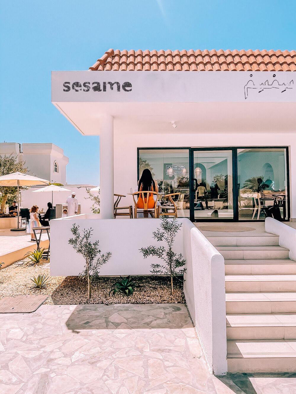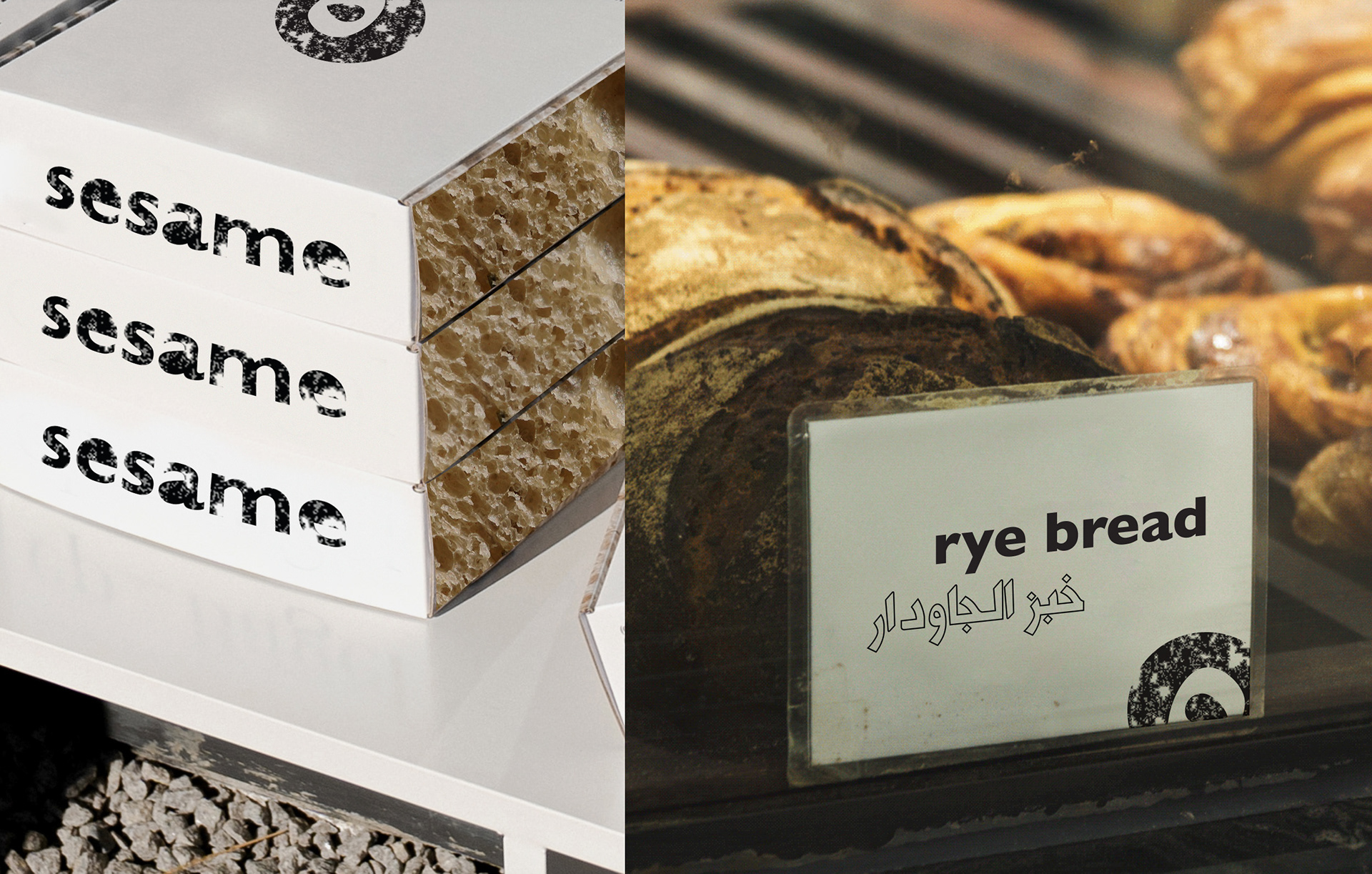
Sesame | Local Bakery
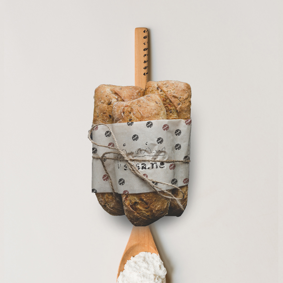
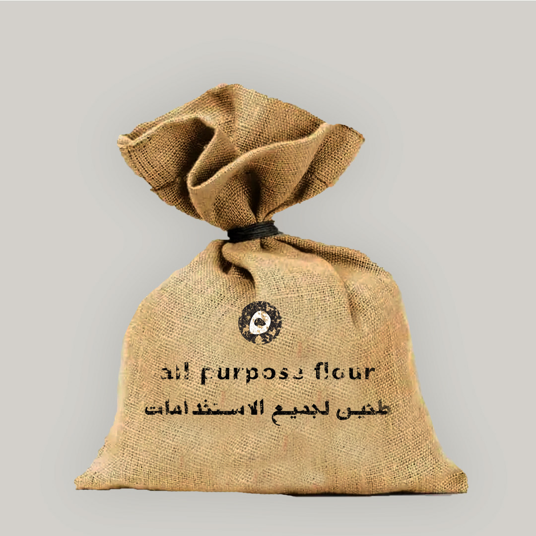
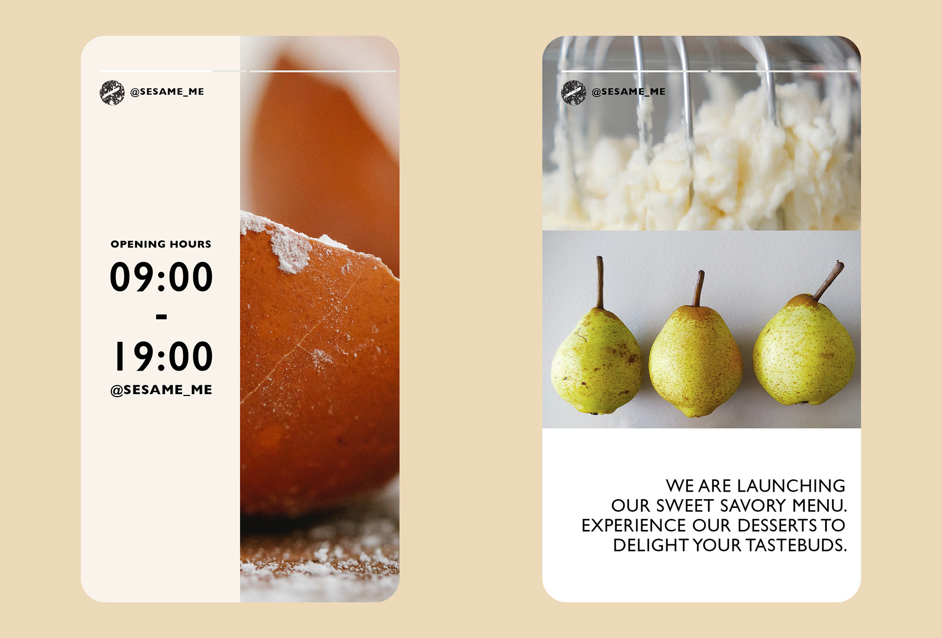
Sesame is a bakery set in the heart of Fujairah, offering various baked goods of local and regional cuisines. The project entailed a holistic approach from naming to signage, packaging, interior design, social media assets, uniform and installations.
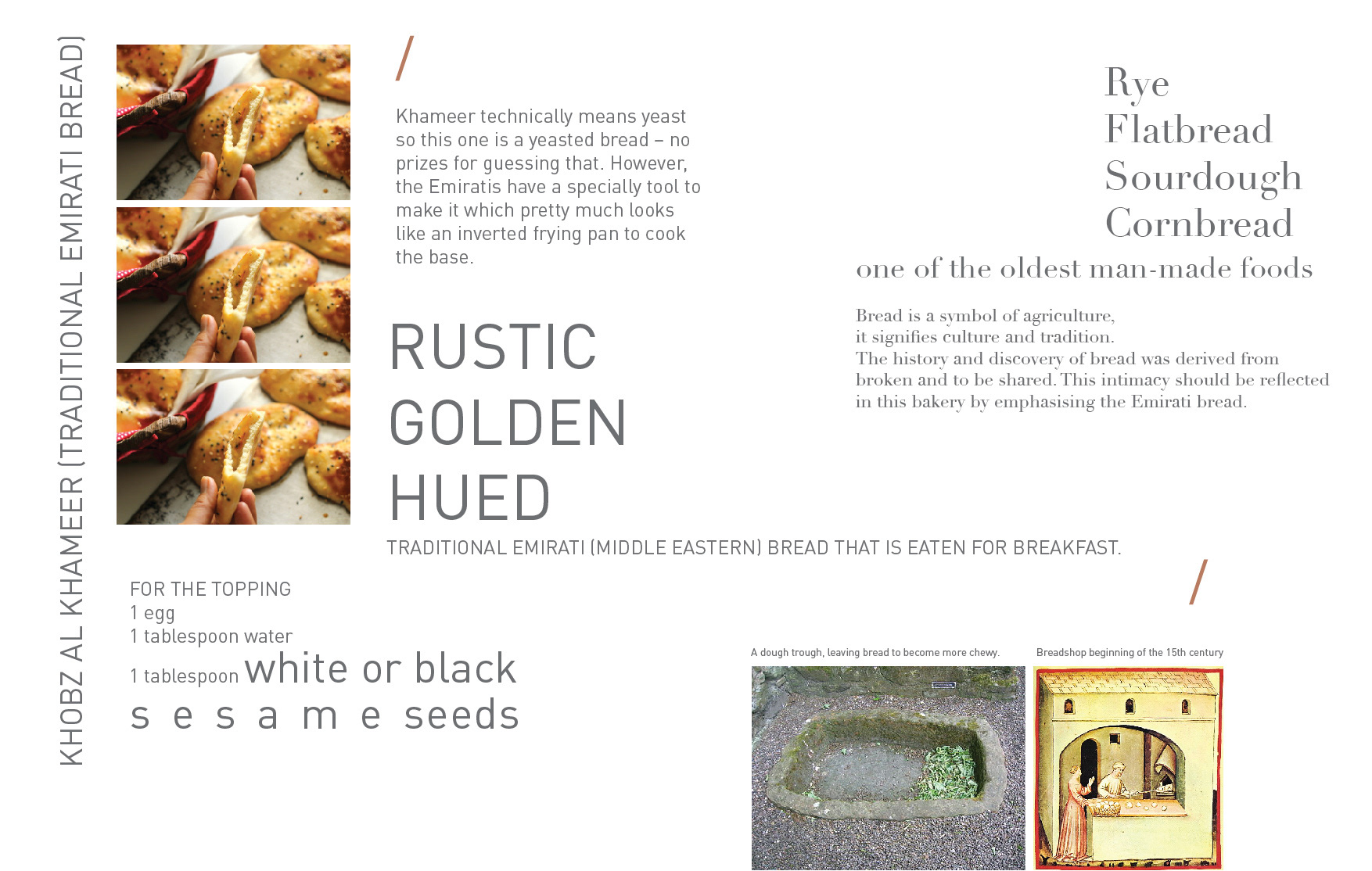
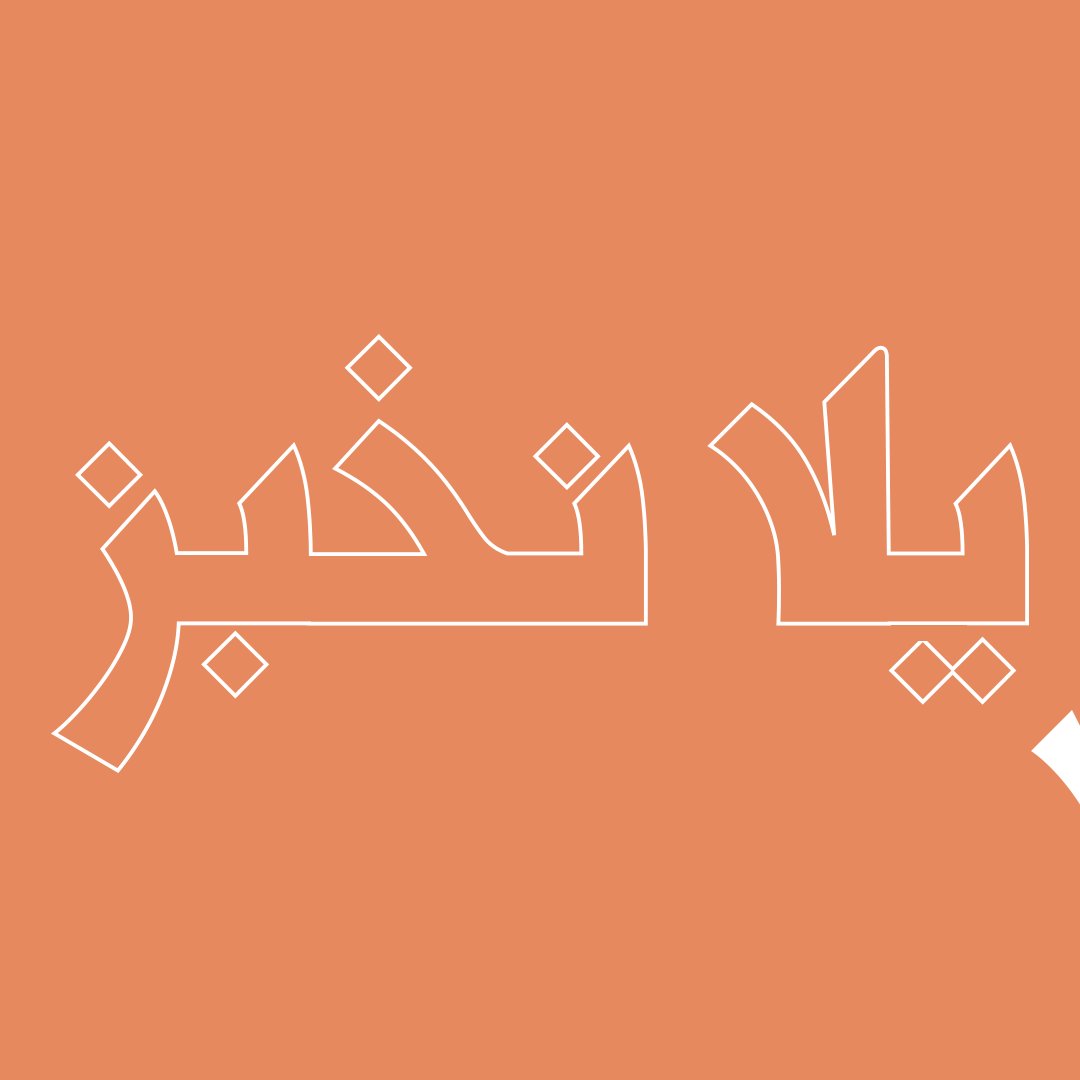
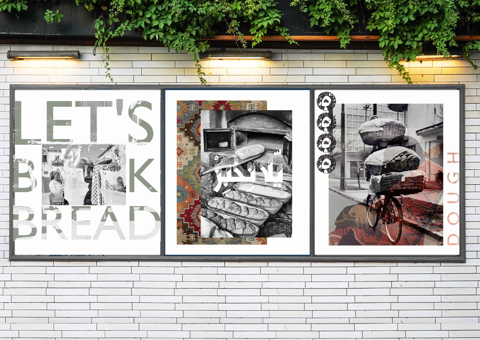
Sesame was the selected name as the seed itself is the last ingredient added to traditional Emirati bread. The cultural exploration sanctifies the local delicacy in the heart of Fujeirah whilst welcoming foreigners and tourists to explore the culture.
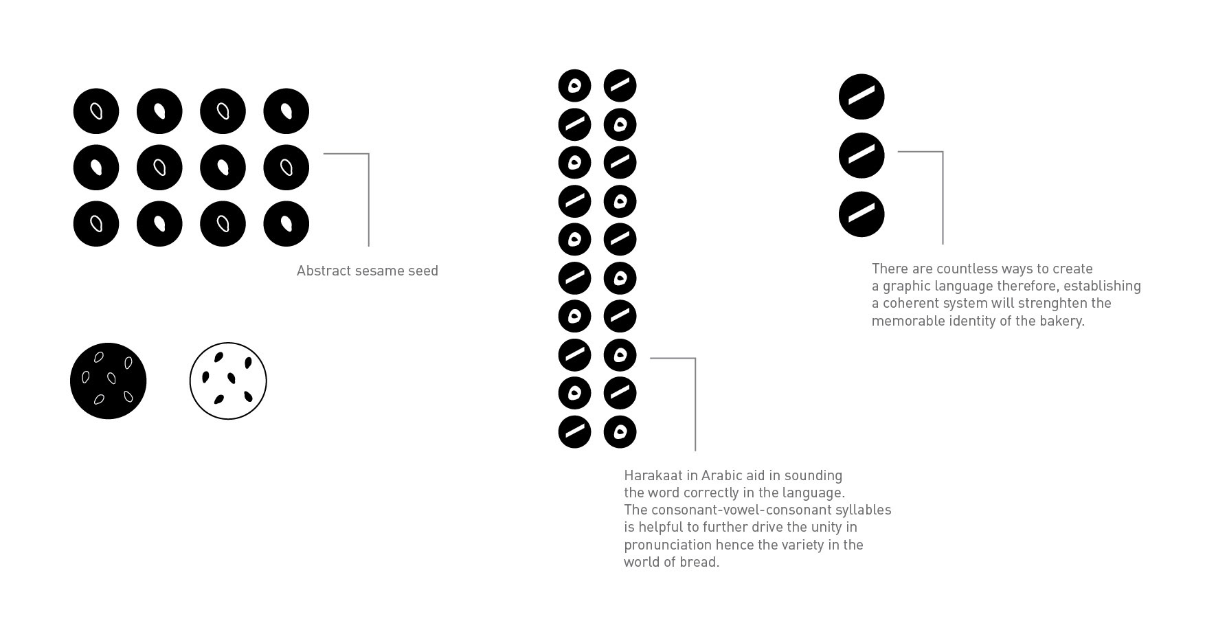
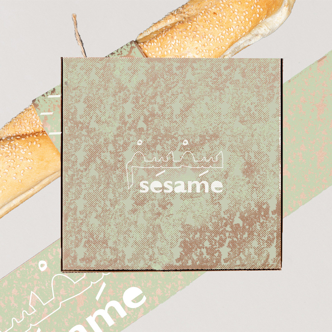
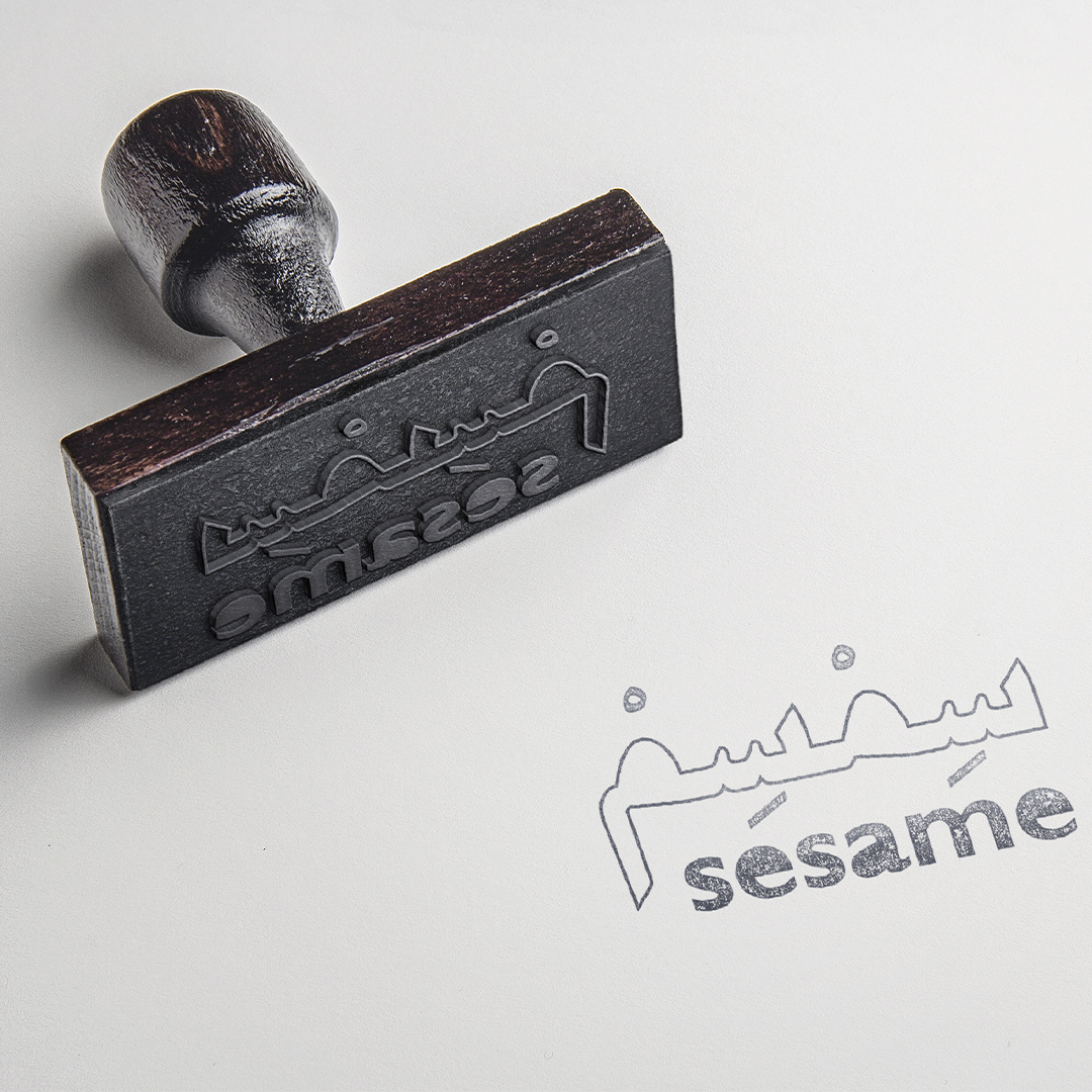
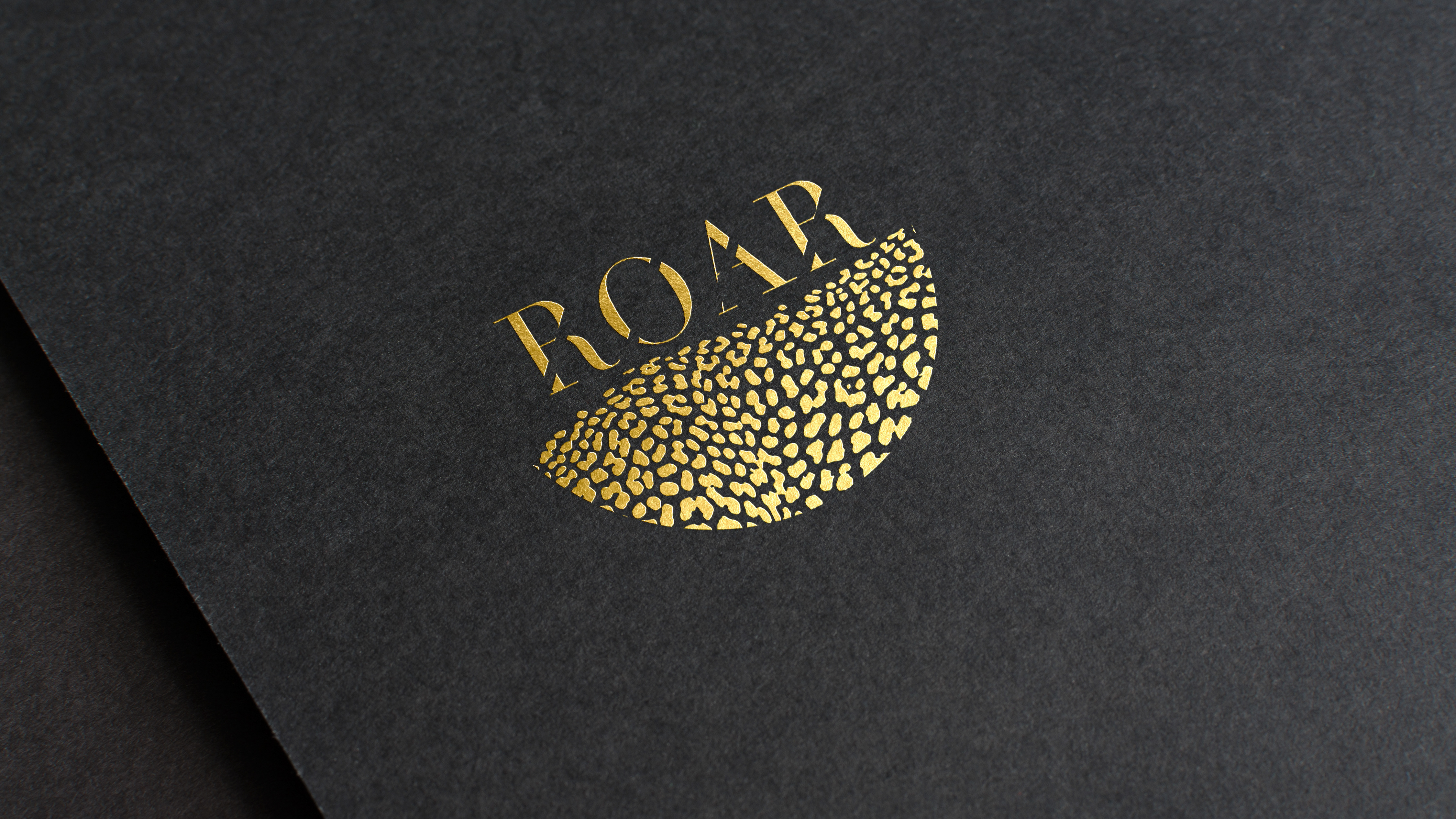
The bilingual logo emphasizes the baker's experience by using a unique serif font in a solid colour to balance the outline of the Arabic Naskh font. The 'harakah' dictates the pronunciation in Arabic, as well as add a visual character to the logo to tie in both languages.
The visual graphics and colour schemes were inspired by the local vibrancy of the country. Combining bright orange and the intensity of a deep, rich red are contrasted against the greenery as well to create visual UAE symbols.
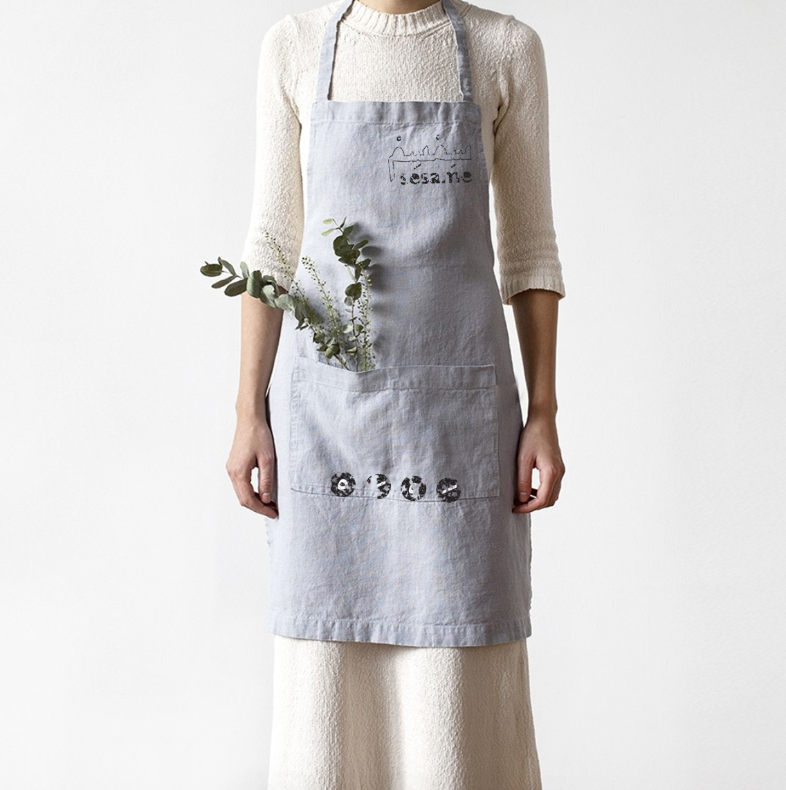
The combination of brand elements is to be used in textures, icons and most of all typographic explorations which shape the main visual behind the bakery. Typography is used as a narrative to drive the brand's direction towards local language, layering of patterns and storytelling behind nostalgic food. The use of textures is inspired by raw cooking materials which create a sense of transparency, and comfort, but most of all, reflect the identity's inspiration.