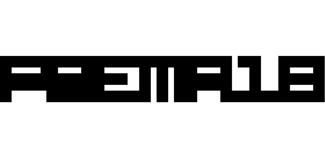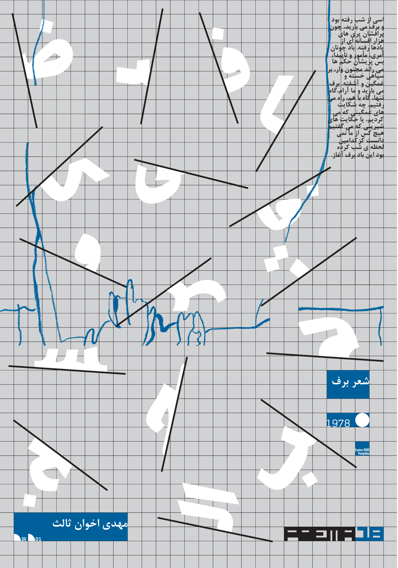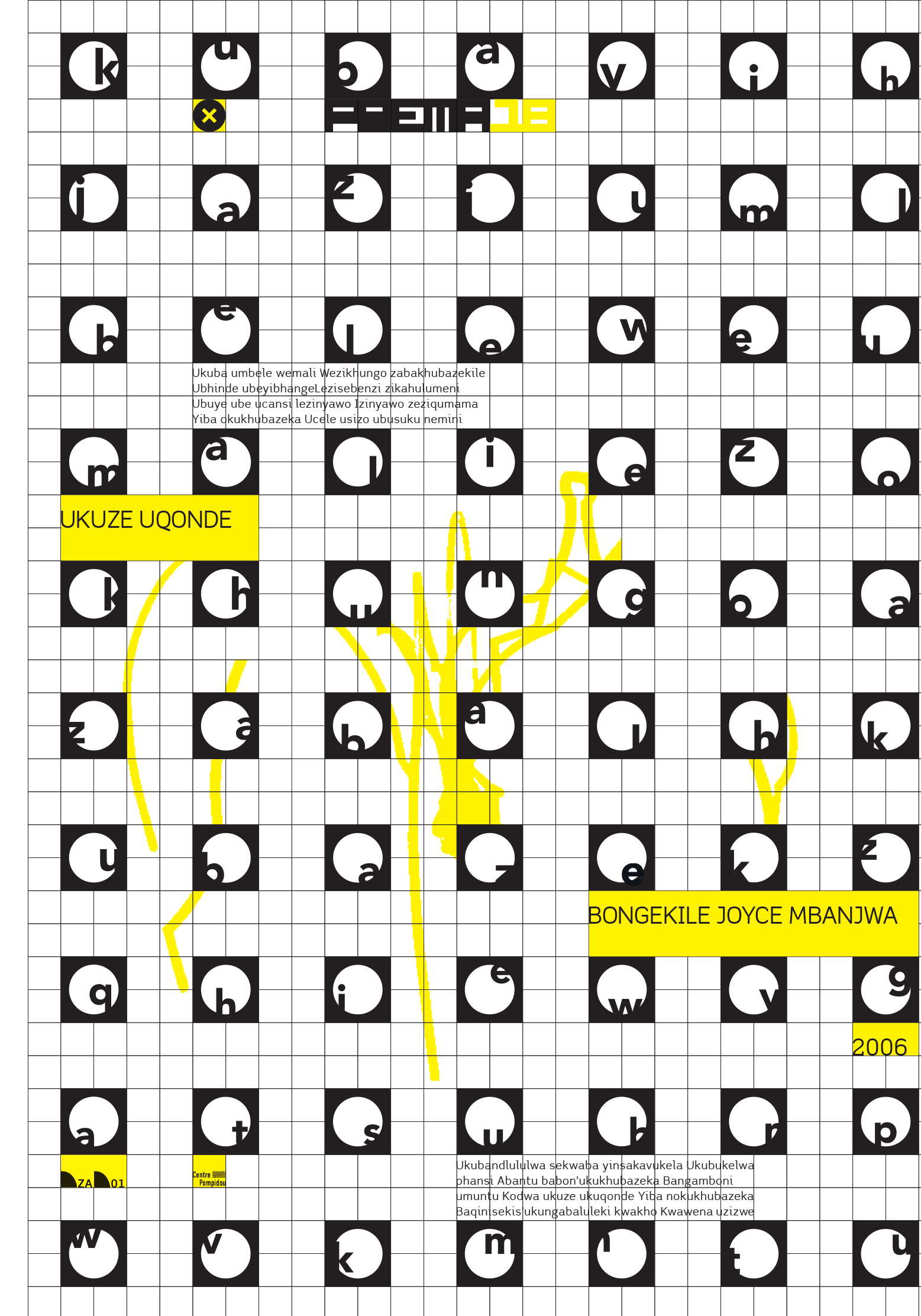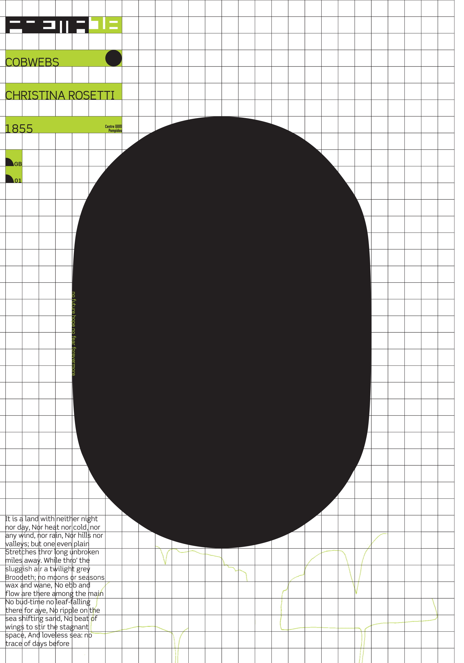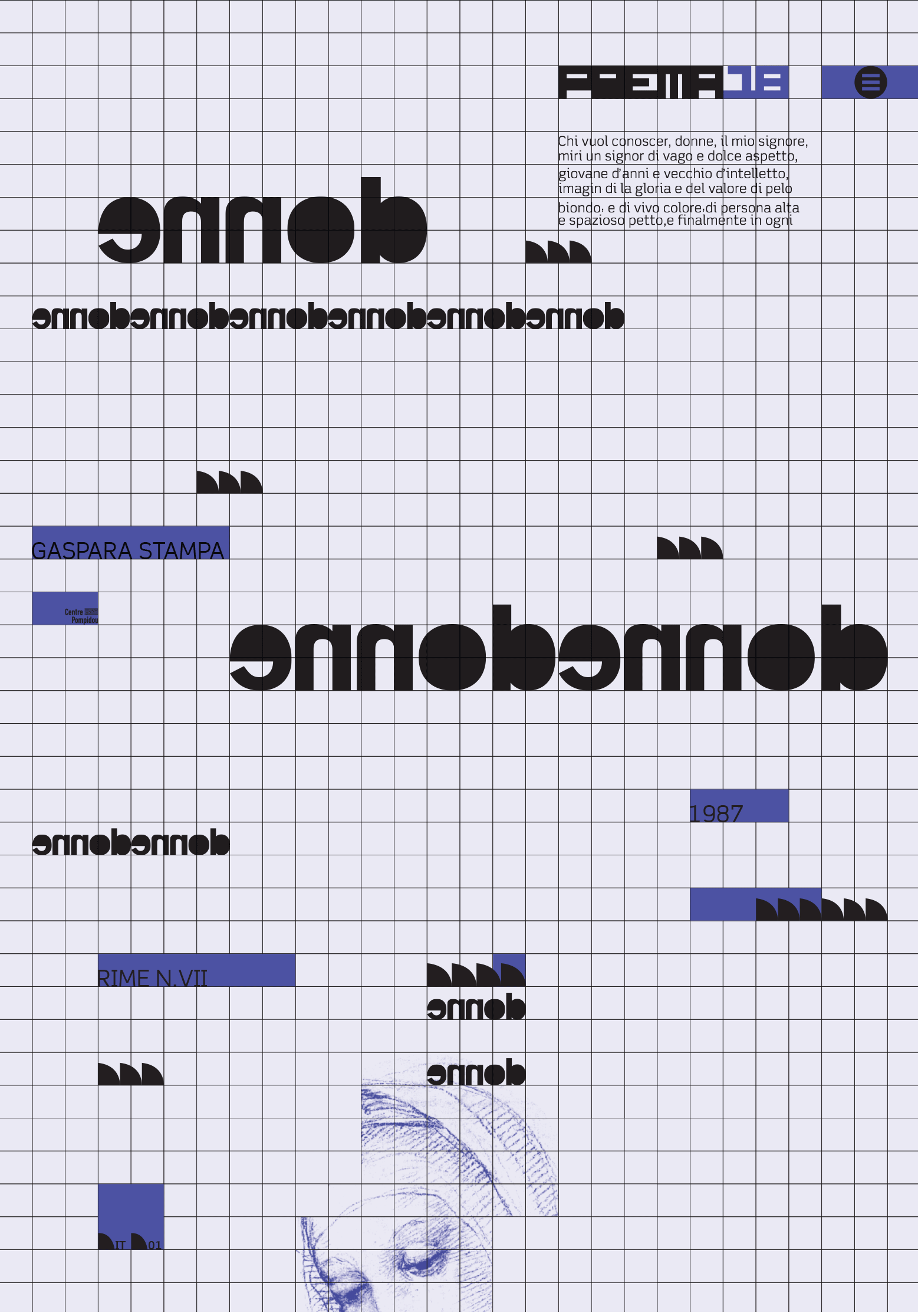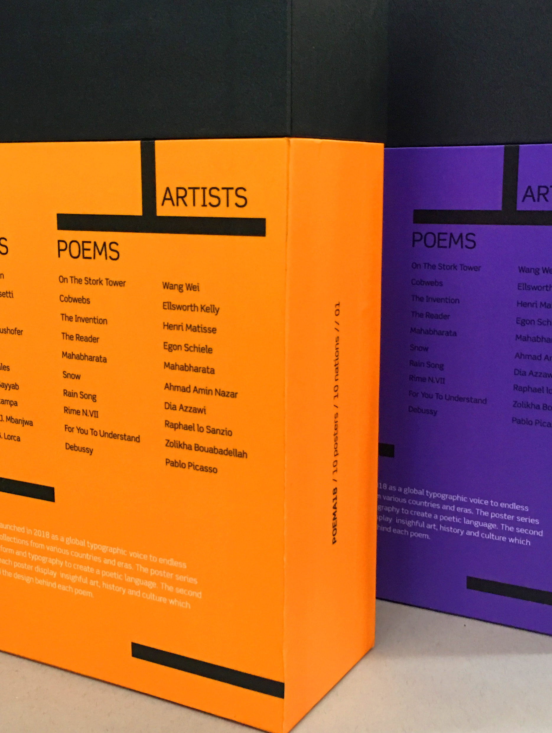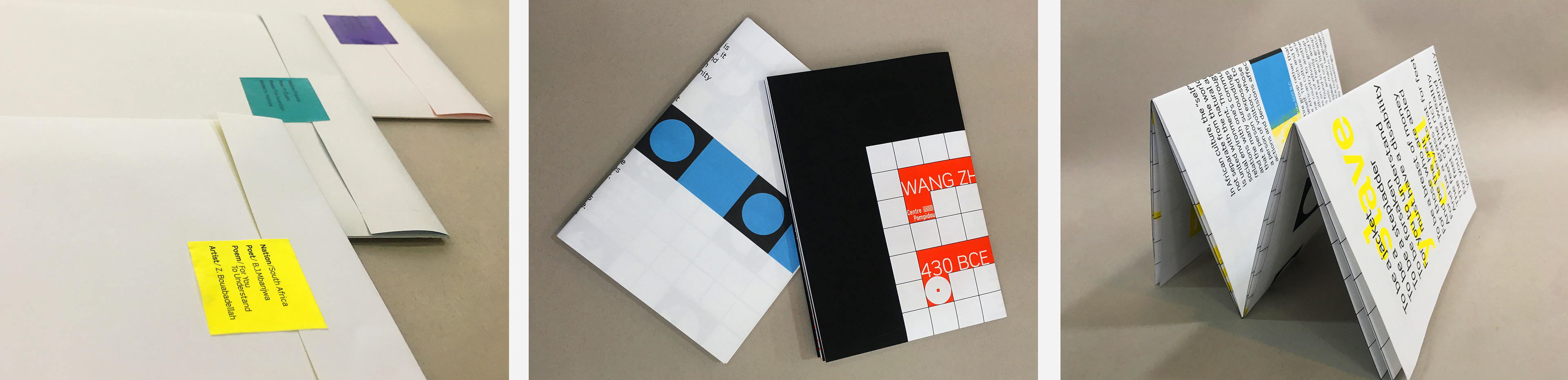
POEMA18
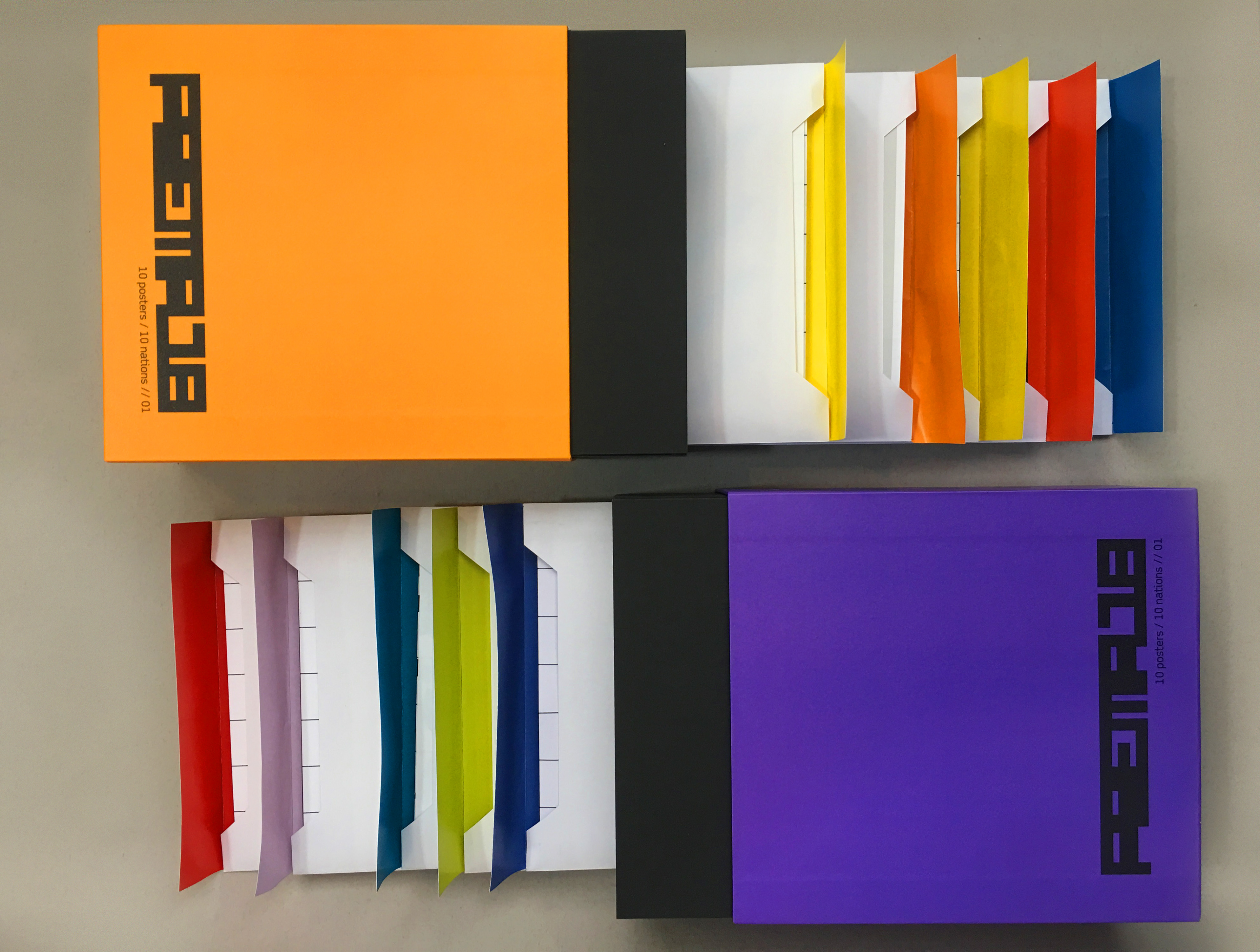
Poema18 is a visual voice between poetry and graphic design. It is a poster collection that explores the relationship between words and design. Not just any word, but rather the fragile emotion and powerful language from history evoking savored memories throughout time. Each edition contains 10 double-sided posters from 10 different nations and 10 different poets.
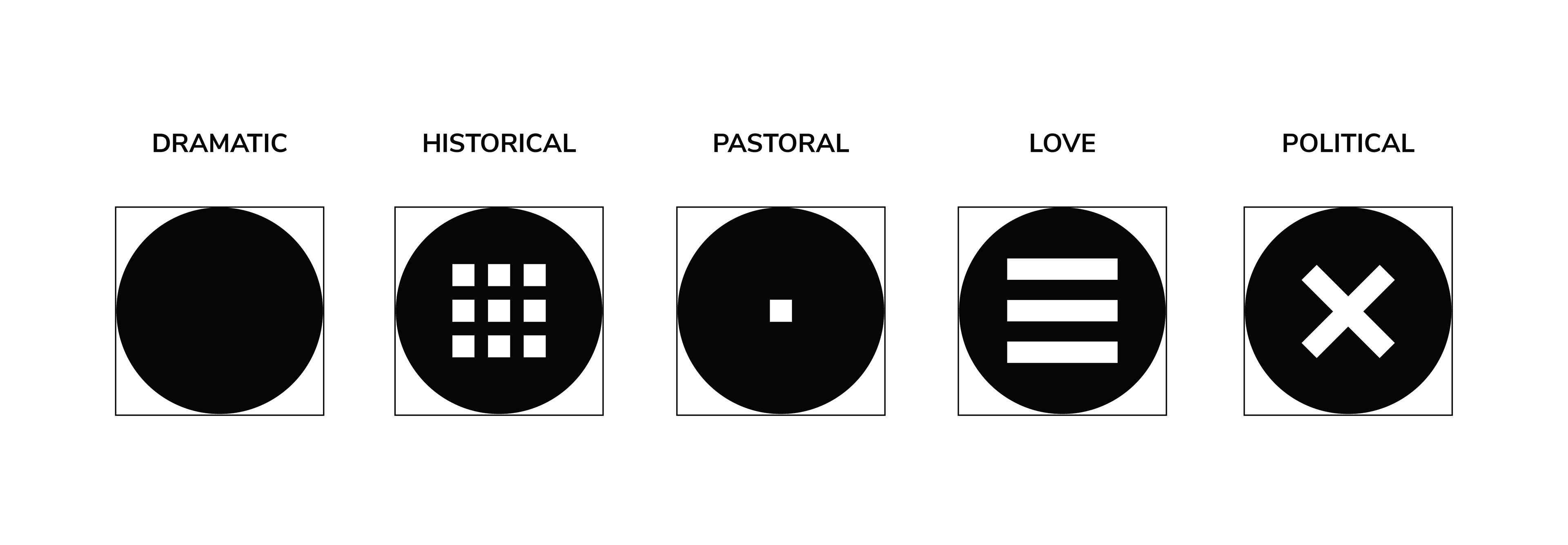
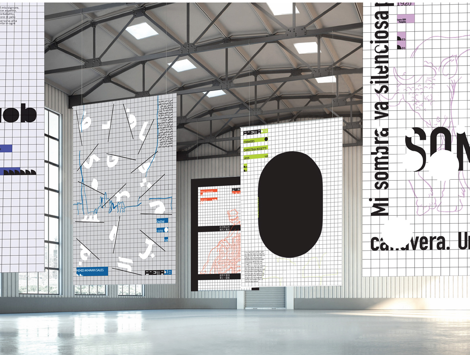
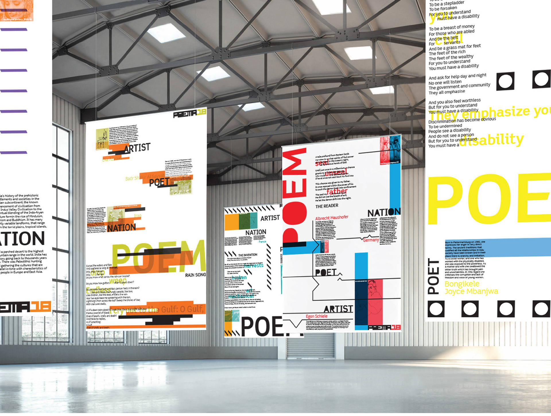
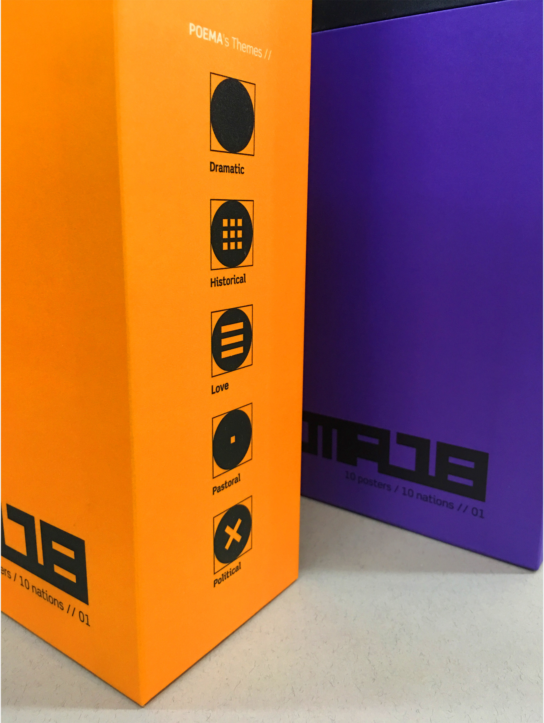
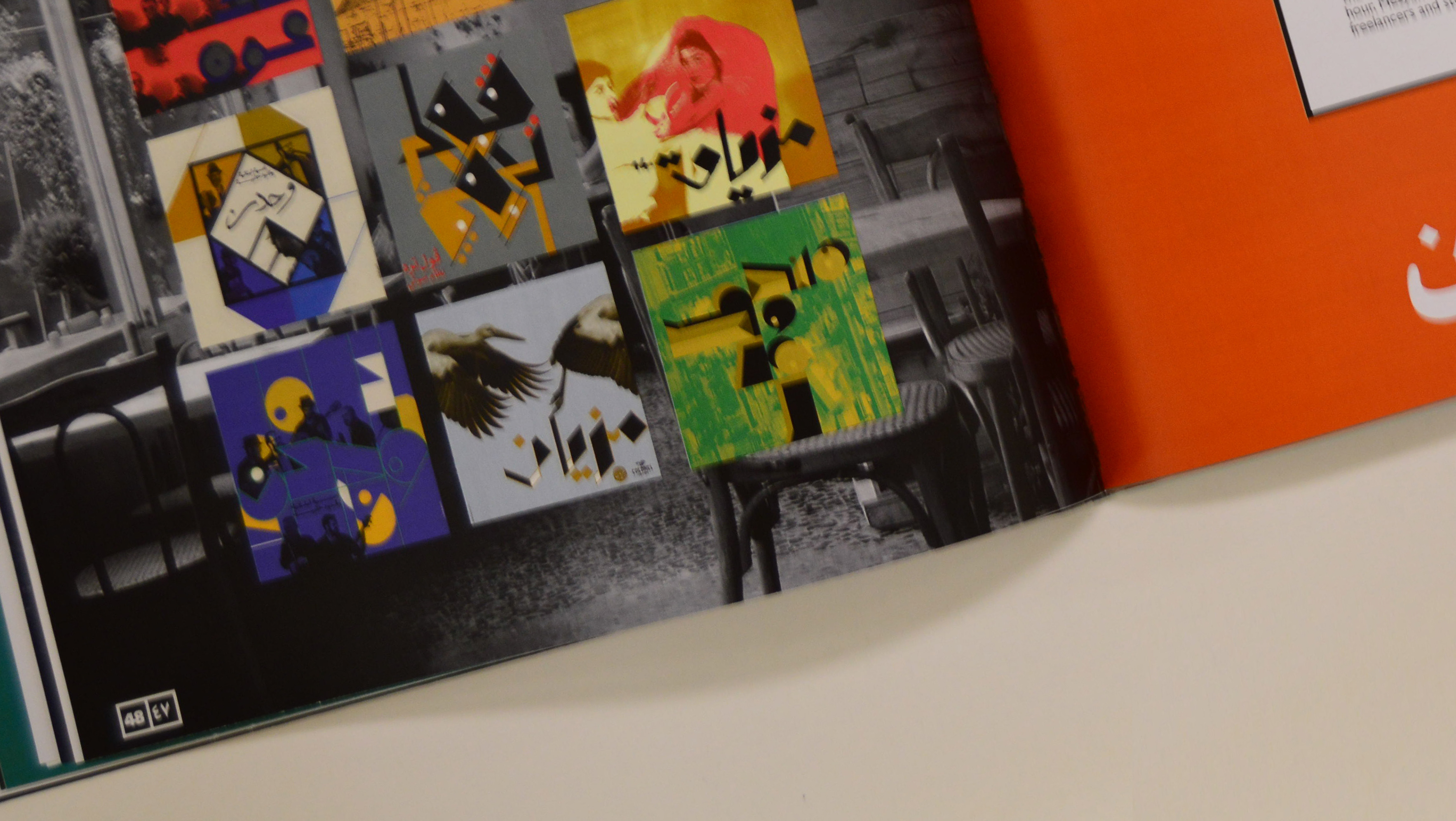
The logo was created from a grid system which then became the visual language that tied all assets followed. The grid was used as a base to form an abstract identity for the poetic category legends. Furthermore, the grid was then used across all posters to read key information. Yet, breaking the grid by freeing visual elements became the symbolic language of how poetry never followed one way of expressing emotion.
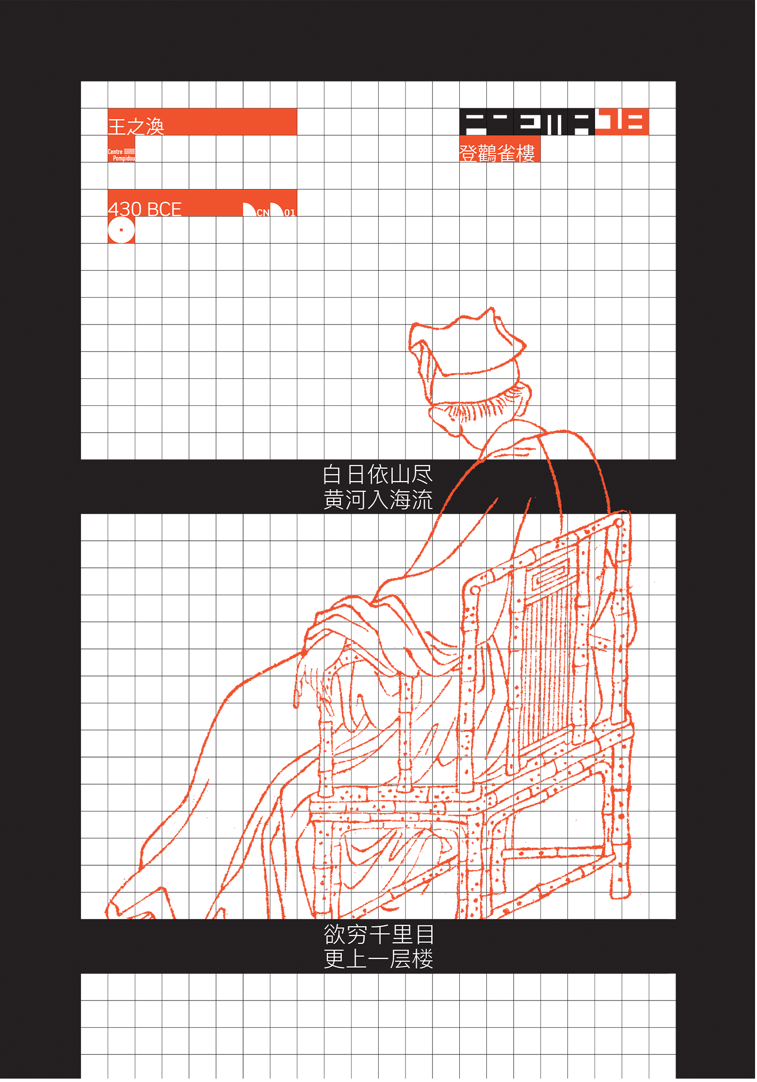
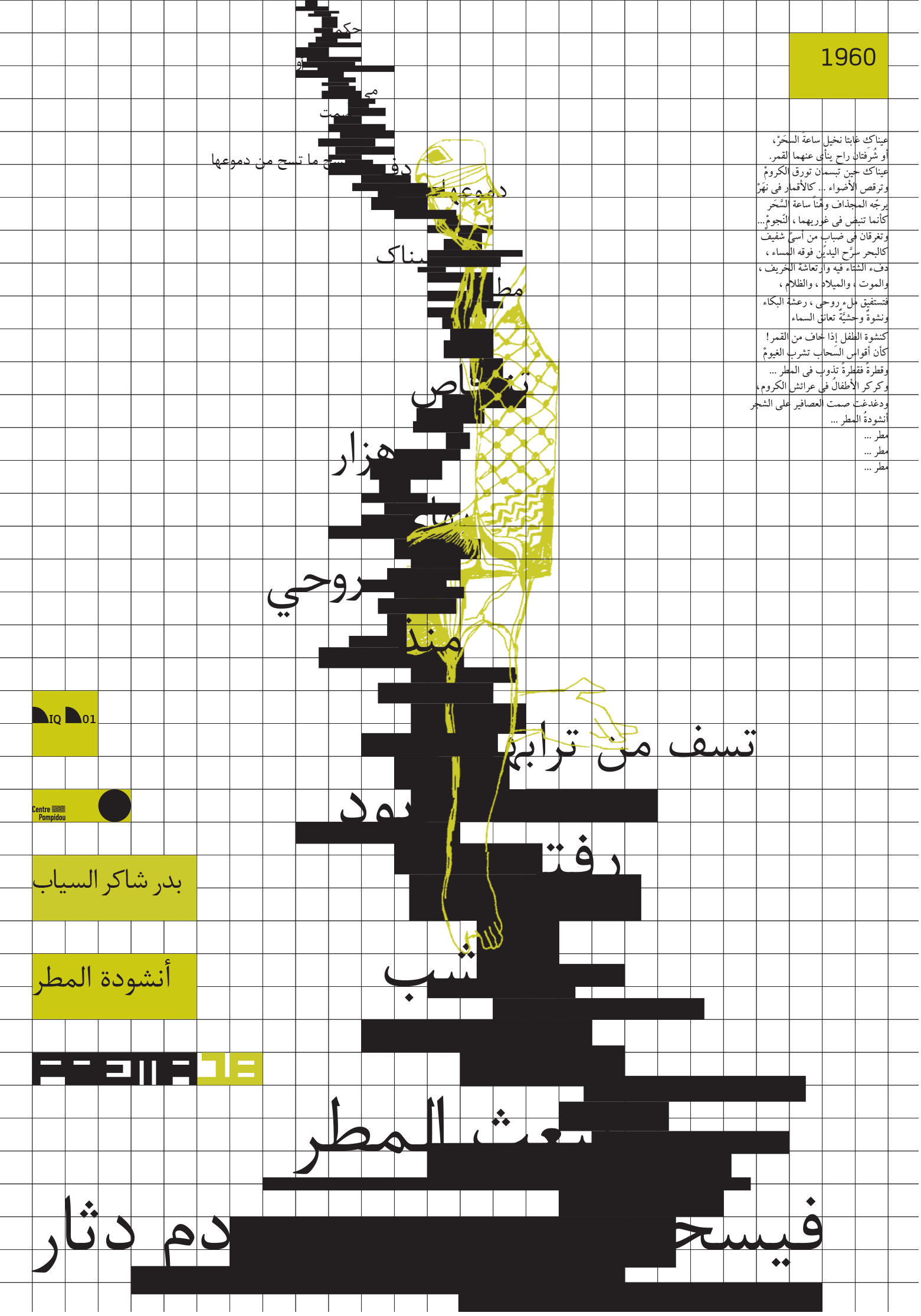
The dynamic narratives and visuals were created by extensive research behind each poem and the art during that era. The projection was to create a strong visual language that encompassed all information and graphic illustrations into compositions for each country.
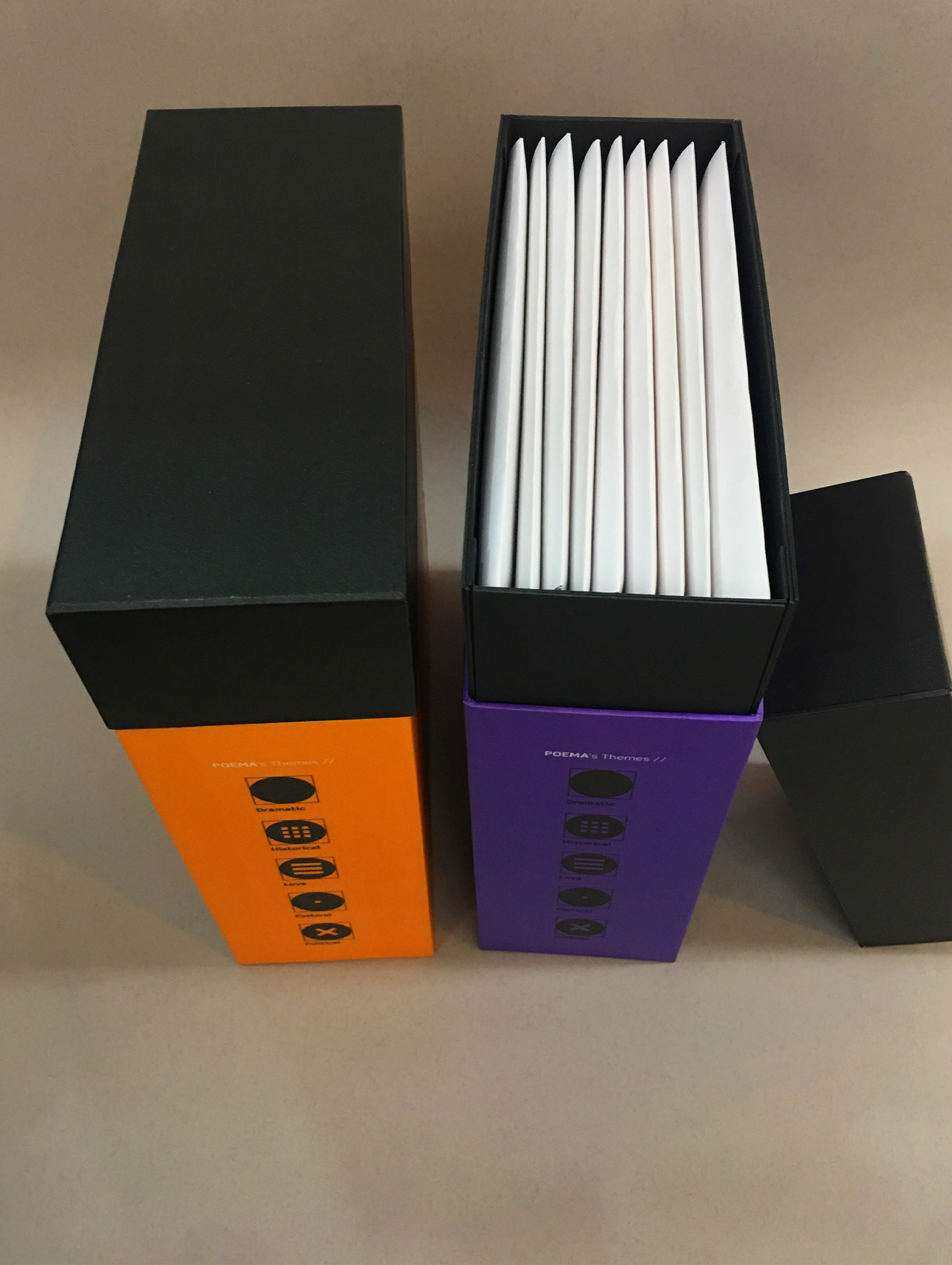
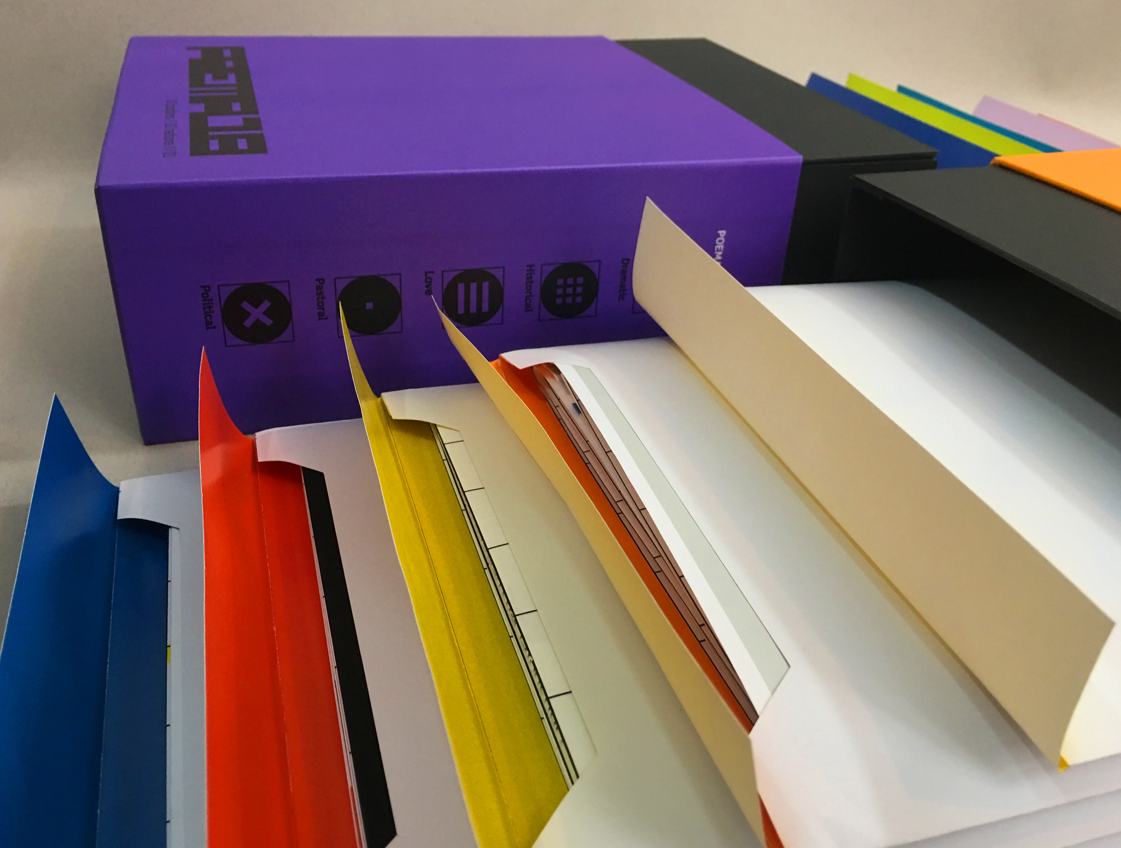
Each poster was suspended in a museum. One side of the poster revealed an educational insight explaining the history behind the poem chosen, the poet, the artist and the nation. The second side revealed feeds the eye with free-hand drawings inspired by an excerpt from the poem. The audience's senses are stirred as they are isolated in their own space and connect emotionally to typography, shape and colour. The purpose is that the content becomes an interactive experience.
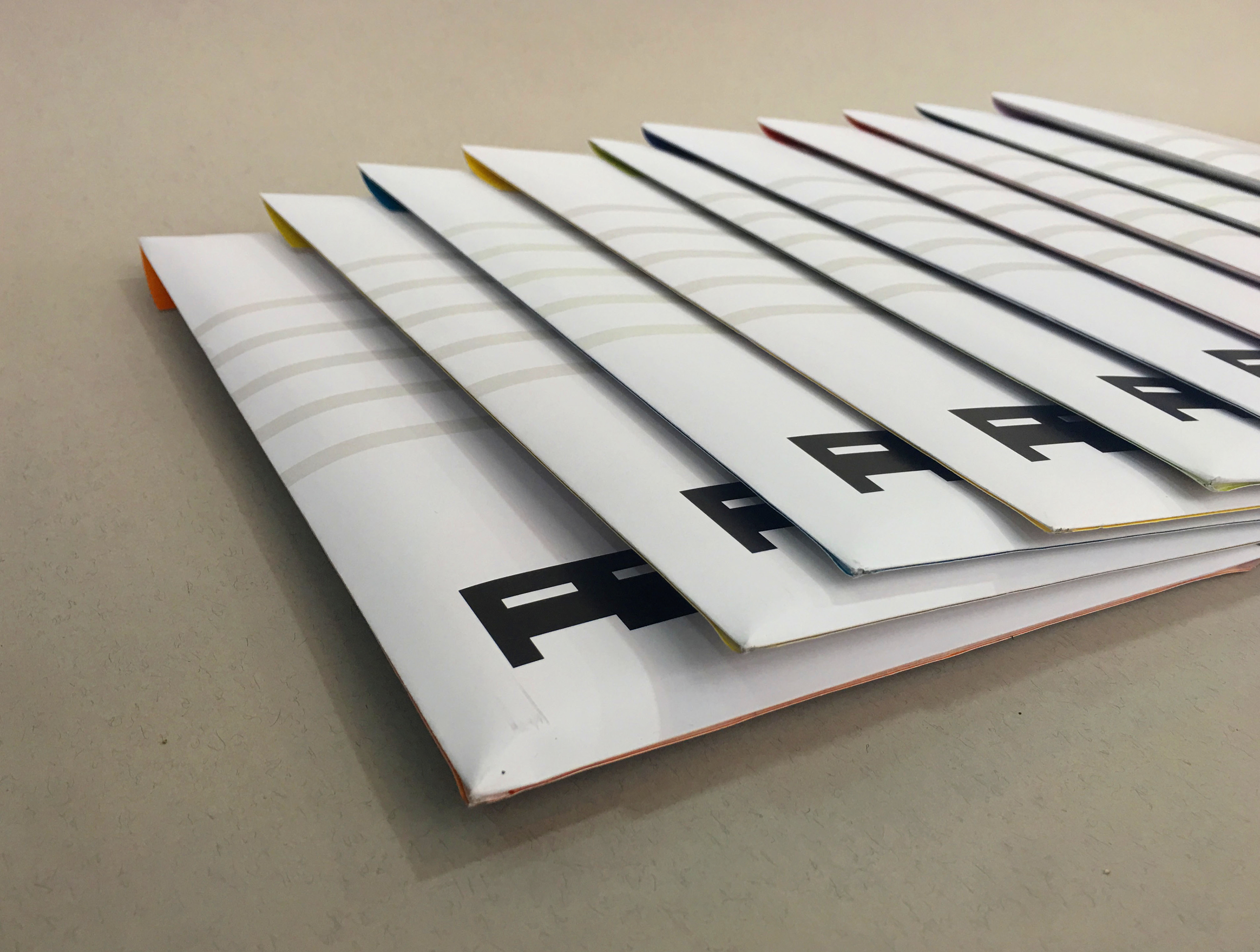
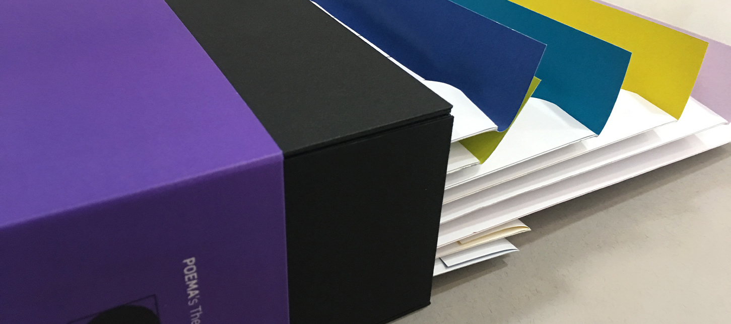
The posters are folded and packaged in envelopes; the graphic language is a documented visual.